Prismic Guide
A Simple, How-To for a Simple Content Management System
At The Juniper Studio, every client site we create uses a Prismic content management system. These repositories (repos) are preloaded with our tried and tested components. And whilst no two websites will ever be the same, the fundamentals of how to use your Juniper-configured Prismic repo will be the same.
This guide has been written assuming that we (Juniper) have set up your admin/backend development work and that your production (live) website is available - if not, please contact us for further support.
If you have used an alternative provider for your Prismic site development, we are happy to help and can consult if needed; however, we would recommend you revert to them in the first instance.
Introduction
We intentionally tried to keep our clients' setup in Prismic as simple as possible. There are a few key things to understand early on.
There are some quick links accessed on the left-hand side. You'll only need to use:
- Main Space
- Media Library contains all site images and any PDF documents.
- Language (if you have a multilingual site)
- Documentation (generic guidance on how to use Prismic
The following are for developers only:
- Migration release
- Invite
- Custom type builder
- Settings
⚠️ Warning: Do not make changes in these sections; this can have a detrimental effect on the website.
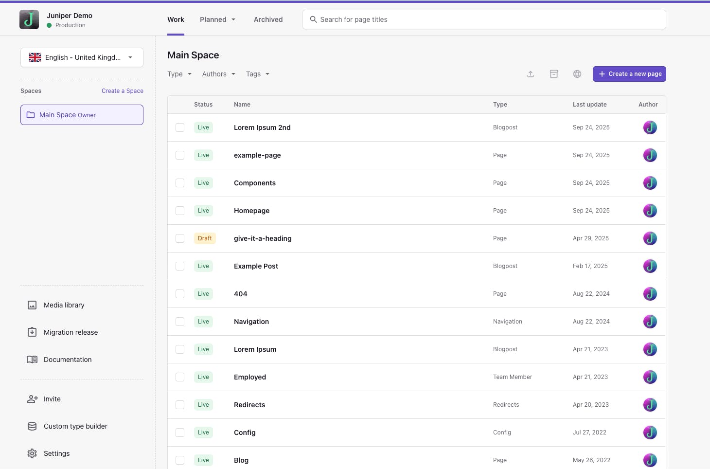
Page Builder
This is your document dashboard, where you will be able to access all pages within your site. Depending on your site setup, there are (generally) a few types available;
- Navigation (single-type)
- Configuration (single-type)
- Page (repeatable-type)
- Blog (repeatable-type)
Pages
Creating a new Page
Click Create a new page on the top-right, select the page type you want to use, and a blank template will open.
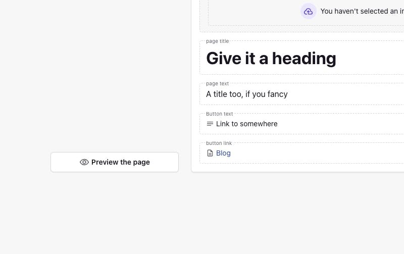
Get started by adding a 'Page Title', and then you have a range of slices you can utilise.
You will need to add a Page Title, as well as an optional Page Image, Page Text, Button Text, and Button Link in the Main section.
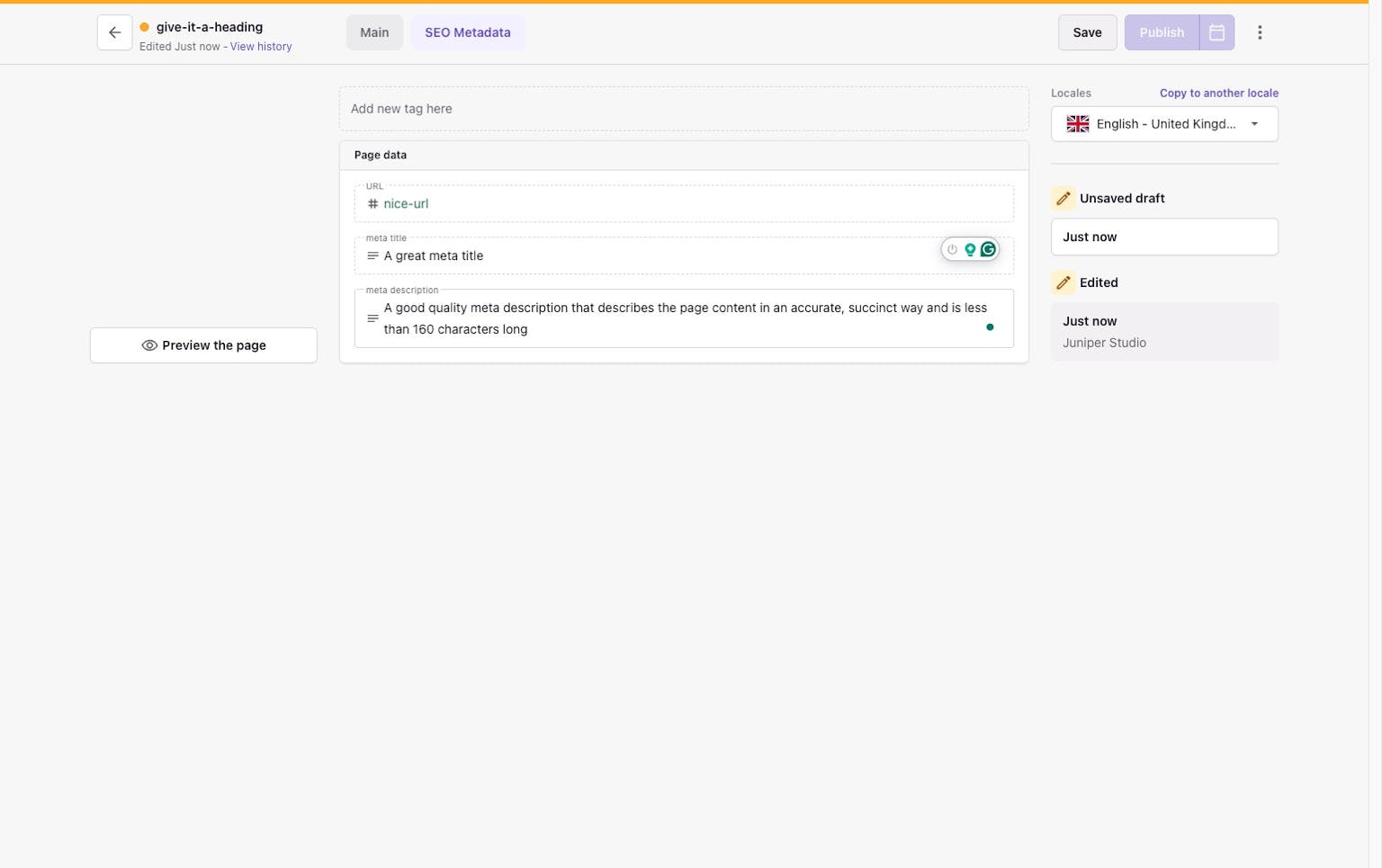
Before you publish, don't forget to tailor your page for SEO
Head over to the SEO Metadata tab
To maximise your pages' SEO, ensure you check and add the Meta Title and Meta Description on the SEO Metadata. You can also adjust your URL, which would have used the Page Title as a default. Check and update to something short and logical.
Page Status
You’ll notice that when you're editing pages, you may notice the very top bar of the page changes to Amber, which indicates it’s in edit mode. A page that shows a Green bar is the live version of the page.
It's important to remember that editing pages has no effect on your live site, meaning you can work in edit mode without concern. Only publishing deploys any live changes.
Building your page
You start in the Main tab
In here, you have the option of building your page out with the building blocks called Slices. You can add these by selecting Add Slice from the top left.
The following Slices are available to use:
Text
Purely used to create blocks of Text* with the option to add a linked Button to the bottom.
Banner With Caption
This is a block that allows you to have 1 featured Image with Text* and a linked Button
Hero
This component can be used if you want to create a featured image. Includes Image, Title, Text and a linked Button.
Quote
Allows you to create a snippet of Text, and attribute an Author (Their Image, Name, and Company/Position)
Card Deck
This is similar to Banner with Caption and is perfect if you want to create a collection of tiles in a row that link to other pages. Contains an Image with Text* and a linked Button
Counter
This allows you to display a range of numbers, which animate to count up
Image Gallery
A slideshow of Images allowing you to add an optional Title above, and a Caption. If a single image is loaded, the slideshow controls do not display.
Video
Embeds a YouTube video
FAQ
Allows you to add a Title, Text, and adds a repeatable list of Questions and Answers
Map
Allows you to add a Google Map URL to embed a map
Contact
Developer-controlled contact form that can be added to any page.
If you cannot see these Slices in your current setup, let us know, and we can enable them for your site.
* Text fields set up with additional formatting like:
- Lead text
- Bold text
- Italic text
- Heading types
- Numbered and Bullet Lists
- Links
Hint: If you aren’t sure which slice to use go to the /components on the live site. For all of our clients, we add a sample page using examples of each slice. You can then compare this page with your work-in-progress page in Prismic.
Each Slice in more detail
Banner with Caption
This is a block that allows you to have 1 featured Image with Text* and a linked Button.
Text (with Button optional)
This is the main content container. Within here, you can add the content you need.
There are a few restrictions, but you have the freedom to ensure the display of your pages adheres to your branding, with the ability to format a lot of the copy.
By typing into the Text space or highlighting a word/sentence/paragraph, you'll see some options to add formatting:
Handling Images
When you want to use images, you have a couple of choices on how to get them added.
Upload the images in advance
Before you start creating a page, you can upload images directly into your Media Library. Doing this in advance is perfect for when you're bulk uploading images.
Upload the images whilst in page writing/content creation mode
Upload whilst writing your content, you'll see that some slices will expect/allow images to be uploaded. If it exists, the Slices Image field indicates this. Click Select Image to open the Media Library.
Then simply select or upload media, add the alt text and tags if needed.
DON'T FORGET ALT TEXT
Alt text (or alternative text) is the way to add a description to an image. If an image fails to load, then the text will display as a fallback, helping users understand what should be there. It also aids users when visiting the site using assistive technologies, it's a digital best practice requirement, and aids with your site's quality rating, improving the page's SEO. Read more on our Alt Text for Images section on our recent post, Integrating accessibility features into your website.
Is there an image size limit?
Good news. There's no limit on the image dimensions. There is a limit to the total file size, which cannot exceed 10MB per image.
Adding Links
Buttons will need a working link. Also, you can add links to content to ensure that your users can navigate to the parts of the site that they will find useful
Select the text you want users to click on and hit the link icon, which brings up the Select a link panel.
In the dropdown, select
- Link To The Web is for External Links - paste your URL in
- Link to Document is for Internal Links - to other pages set up within your Prismic site (see below)
- Link to Media Item is for PDF Links - to PDF documents added to your Prismic media library.
Want the link to trigger a phone call or send an email?
You can utilise the Mailto and Tel types - this will allow you to make links that either send an email or prefill a phone number.
To do this, select the text and click to add an external link, but instead of pasting a URL, add the content as follows:
- For email, enter mailto:{paste the email address}
- For phone, enter tel:{enter the phone number}
If you've done it correctly, the button below should ask you to confirm that you want to add that Tel or Mail link.
1. To link within your website, choose Link to Prismic Page
2. A window will appear, allowing you to choose a page (or filter by page name)
Slices
Hero
Here you can add an Image, Title, & Text. If you want to link it somewhere, then you can also add Button Text (what the button displays) and Button Link (where the button links to (see Links section for more information)).
Image Gallery
The image gallery allows you to upload multiple images and the site will display them a slideshow. You can add a caption in at the bottom of each image, and the main title above the gallery, both of which are optional.
Uploading only 1 image to the Image Gallery will remove Slideshow controls.
Changing the images
Clicking within an image field shows 3 options. If you select the left Select Image option, your Media Library will ope,n where you can select a different image.
Selecting a new image will return you to your page, or you can click the arrow in the top left corner will return without changes.
Order of images
The order of the items in the Carousel can be controlled by dragging the block using the = icon top-right (next to the bin) in each block.
Quote
A small snippet of text that contains a quote/testimonial from a client/customer. You can add their Image, Name, Position and/or Company
Card deck
Similar to the Banner with Caption, this allows you to show more items as a small row of repeatable cards to link to different pages.
Video
This is set up to link to a YouTube video. Paste a YouTube URL in the Video field. If the format of the URL isn't correct, Prismic will flag a warning.
Video
Need to move your slices around the page?
Click on the slice you wish to move and on the left, your slice indicator box will show where you are. You can click on the 3 dots immediately below to choose to move (see example). Alternatively, click directly on that box and you'll be able to drag it up and down to reorder as needed.
Navigation
Controlling the main navigation (the Header & Footer) within the site is also something within your control.
Header and Footer Links
There is a Navigation type within your dashboard. The Header and Footer tabs allow you to add page links as required.
Configuration
Company Information
The Company Info tab allows you to add your company name, contact address, and phone number.
Social Media
Within Social Media, you can add any social media channels to the footer that you may have. These will add the icon and the link, which opens in a new browser tab to ensure that your clients still have your site available. We’ve included the most popular:
- YouTube
- TikTok
- Twitter (X)
Open Graph
These images are used for display when links from the site are shared across social platforms. If you're not sure how this looks, check out www.opengraph.xyz
Previews
Preview allows you to view your changes before they are customer-facing. Avoiding the need to publish your changes and view them on the live version of your site.
The preview is simple. Once you have made a change to a page, click Save once (and the option changes from Save to Publish) and on the bottom left of the page, the Preview button should activate.
On click, you'll be sent to the preview of your website. You can then see how your change will look when it goes live, check the links and generally review it safely before it is customer-facing.
You can then close the tab and continue on to Publish as normal.
The Publication flow
When you are finished with changes, you need to select Save, and the option to Publish becomes available. Once clicked, you can then select Publish within the panel that appears. The site should update within a couple of minutes.
Scheduling releases allows you to create a version of one page or many pages to publish at a set date, if you would like further information on how to set that up please contact us.